
12 New Responsive Web Design Tools
 admin
admin
09/10/2019
0 Comment
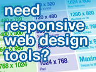
Take some of the pain out of responsive web design
Let’s get right to it today – we found this helpful post for you web designers working on responsive layouts and wanted to share it. Check out these great responsive web design tools — there are 12 tools in all over at WebDesignLedger ready for you to get your hands on.
For those of you wondering what responsive web development is – it’s the term used for creating dynamic web page layouts that resize themselves automatically to create a page designed for a number of different delivery platforms. In other words, you code the page once and when you look at it on your iphone, ipad, web browser, Android product, or other mobile device – the screen still looks good and dynamically resizes itself to create a layout that is geared toward that specific screen size.
Basically you use device sniffing code to determine screen size and hopefully device type and then you use CSS to dynamically allow the screen to adjust to fit that device – OR you send the device an entirely different layout if needed. Here’s some more detailed information on responsive web design.
Responsive web design can be tricky – but it’s a stock requirement these days with all the different platforms that web designers need to be targeting.
Take some of the pain and hassle out of your day with these responsive web developers tools – here is a preview of some of the responsive coding tools, and like I said there are 12 total tools available over at this link from WebDesignLedger >>