
7 typography tips for choosing and combining different fonts in web design
 admin
admin
Typography is all the rage now and it will get even bigger in the near future. If you’re searching for a solution to make your website look unique, original fonts and typefaces are something you should definitely look into. Creating your typographic design, you might find yourself working with two different fonts – and that can be surprisingly challenging. Here are 7 key tips to help you choose and combine different typefaces to create fantastic designs.
1. Match fonts to colors and styles
It’s clear that if you decide to feature several fonts, a number of styles and a range of colors, your visitors will get a headache. Your colors should mesh, not clash – use colors from the same hue or saturation level and you’ll be on the safe side.
Your font styles should match the emphasis and weights of the fonts you’ve chosen – a heavy font could do well with italic style to de-emphasize its weight. Underlining can be used with both light and heavy fonts – they won’t appear any heavier.
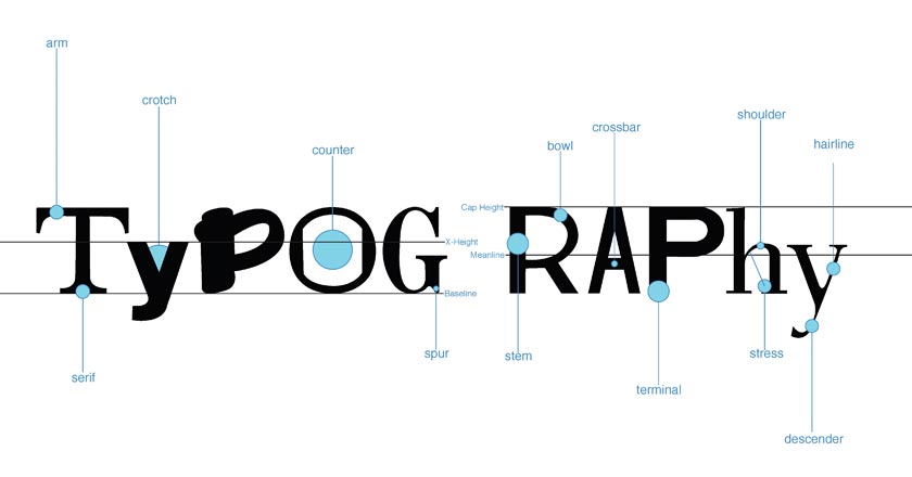
2. Serif and Sans Serif
This is a classic principle for combining two different fonts – by choosing a sans serif font for your headline and a serif font for body, you’ll create a balanced design. Just make sure not to choose fonts that have strong personalities – a font like Bell Gothic has a defined personality and combining it with another strong font might result in a conflict.
3. Avoid using fonts of the same classifications
Fonts from the same classification, but belonging to different typeface families are a big no-no together – they have different personalities that are both asking for attention and consequently render the design unclear. Strong fonts should always be paired with neutral ones – balancing your design, you’ll avoid the unnecessary tension that will affect the perception of your entire page.
4. Clearly contrast font weights
One look at your typographic design should give visitors a clear idea about its hierarchy. This is not only about font size – it’s also about font weights, which combined together should guide the reader’s eye over the design. Make sure that there’s no confusion as to what should be looked at and in which order.
5. Choose fonts of the right scale and proportion
Fonts you should be looking at don’t need to be identical in scale and proportion. Look for typefaces that are either very similar or completely different – they will look strong when placed next to each other. Fonts that are similar will appear to have similar weights on the screen, creating a nicely balanced design – fonts that differ from each other can be put together to give emphasis on specific parts of the page.
6. Mix it up
To create a design that is clear and well-proportioned, play with your fonts – their weight, stroke width, size, kerning, leading and other factors. Now have a look at your page and squint your eyes so you cannot read any of the lettering. Is the overall tonal value of the text still clear? Can you tell which fonts are at the top of the visual hierarchy of the page? If you can, you’ve done a great job!
7. Avoid contrasting fonts too much
Choosing contrasting fonts is generally a good thing, but if they’re really different and you style them to emphasize their distinct features, you might create a visual imbalance that will negatively affect your entire design.
Choosing and combining fonts together is crucial knowledge for making sure your content is clear, readable and well-structured on the page. Experiment with typefaces, styles and colors to achieve the desired effect – but never forget about the central principle of every great design: balance.
Sophie Anderson is a writer with huge interest in web design and new tech solutions. She writes at ActionFonts.com.