10 Most Frequently Made Mistakes in Web Design
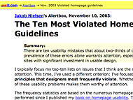
According to our friend Jakob Nielsen from the Nielsen-Norman group – a great list that outlines the Top 10 Home Page Design Guideline Mistakes. They specialize in web page design usability and have been experts in this field for, specifically, about forever. Mr. N also has a much more lengthy post post detailing 113 (yes 113!!) Home Page Design Guidelines if you want to look at this from a more positive and complete perspective.
My personal number one item in Home Page Design Principles is something that a lot of designers forget surprisingly, that being:
Let your users know what your site offers in as clear and simple a manner as possible, right away.
As a person who looks at a ton of homepages designs every week, this is really the most frequently made mistake as far as I’m concerned. We see a lot of really cool looking sites but I have to dig deep into the site, well past the homepage, to understand what the purpose of the site really is. This is as they say, “bad”.
Here’s the post from Mr. N on Top 10 Home Page Design Guideline Mistakes – it’s really a must read for any web designer. Go enlighten yourself grasshopper…

