
How to make easy gradient shadow CSS DIV boxes
 admin
admin
It’s easier than you think to make fantastic looking DIV boxes using pure CSS. Forget about simple stuff like borders and rounded corners, we’re gonna add inner gradients and outer shadows to really give the DIV boxes some flash.
Fast track to cool looking shadow/gradient CSS DIV box:
I want to fast track you on this.. as you know there are a lot of browser incompatibilities when it comes to rounded corners, gradients and shadows in CSS, so let’s get it done!
Basically, IE is a massive failure until IE9 (sorry Bill and friends, but you deserve it). IE 8 and previous IE browsers don’t support many of the cool bells and whistles that Firefox, Safari and Chrome have supported for some time. So we have to repeat the properties using the correct CSS for each major browser group.
Three major browser groups:
WEBKIT: Safari, Chrome
MOZILLA: Firefox
OTHER BROWSERS like IE and Opera
For webkit we use “-webkit” suffix CSS properties like -webkit-gradient or -webkit-box-shadow.
For mozilla we use “-moz” suffix CSS properties like -moz-gradient or -moz-box-shadow.
For other browsers, we just use CSS3 properties like linear-gradient or the IE specific filters like ‘filter: progid:DXImageTransform.Microsoft.gradient’. Then we cross our fingers a lot because the non-webkit and non-mozilla browsers are often tricky and don’t support everything… DOH!
Take this code and use it to put a nice gradient inside the DIV box and a nice shadow around the entire outside of the DIV box:
.gradientBoxesWithOuterShadows {
height: 200px;
width: 400px;
padding: 20px;
background-color: white;
/* outer shadows (note the rgba is red, green, blue, alpha) */
-webkit-box-shadow: 0px 0px 12px rgba(0, 0, 0, 0.4);
-moz-box-shadow: 0px 1px 6px rgba(23, 69, 88, .5);
/* rounded corners */
-webkit-border-radius: 12px;
-moz-border-radius: 7px;
border-radius: 7px;
/* gradients */
background: -webkit-gradient(linear, left top, left bottom,
color-stop(0%, white), color-stop(15%, white), color-stop(100%, #D7E9F5));
background: -moz-linear-gradient(top, white 0%, white 55%, #D5E4F3 130%);
}
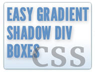
And here’s what the cool gradient DIV box looks like:
That should get you up and running in a jiffy. Mess with the parameters and you’ll have a great looking DIV box for any occasion.
Here are some fantastic resources for making cross-browser CSS and gradient magic:
http://webdesignerwall.com/tutorials/cross-browser-css-gradient